Color psychology in web design: beyond the blue button
Explore how context, contrast and color choices shape a website, with practical palette examples, accessible design checks and better ways to test buttons.
A red button says “Delete account.” Another red button says “Book your Christmas dinner.” A third says “Save 20%.” The pigment has not changed its personality between those screens. The words, surroundings and task have changed what the visitor is being asked to understand.
That is where website color psychology becomes useful. A chart declaring blue trustworthy, red urgent and green calming cannot choose a good palette for your business. A better question is: what should someone notice, expect and understand on this particular page?
Color can contribute to that answer. It cannot supply the proof behind a claim, explain an unclear offer or repair a broken form. Treat it as one part of the experience, with a job you can describe and a result you can examine.
What the research actually tells us
In a study involving 4,598 participants across 30 nations, Jonauskaite and colleagues found shared patterns in color–emotion associations, alongside differences related to language and geography. Participants associated color terms with emotions; the study did not establish which website button produces more sales. See the 2020 paper in Psychological Science.
That distinction matters. An association is not a promise of behaviour. Recognising a color as energetic does not tell us whether a customer will understand your price, trust your service or finish an application.
Andrew Elliot's review of color and psychological functioning also stresses context and caution when applying research. It discusses hue, lightness, chroma and viewing conditions. “We chose blue” leaves much of the actual visual experience unspecified.
The practical conclusion is modest: use research to ask better questions, then review the complete page with the people it is intended to serve. Do not turn a study about associations into a guaranteed conversion percentage.
One business, three different first impressions
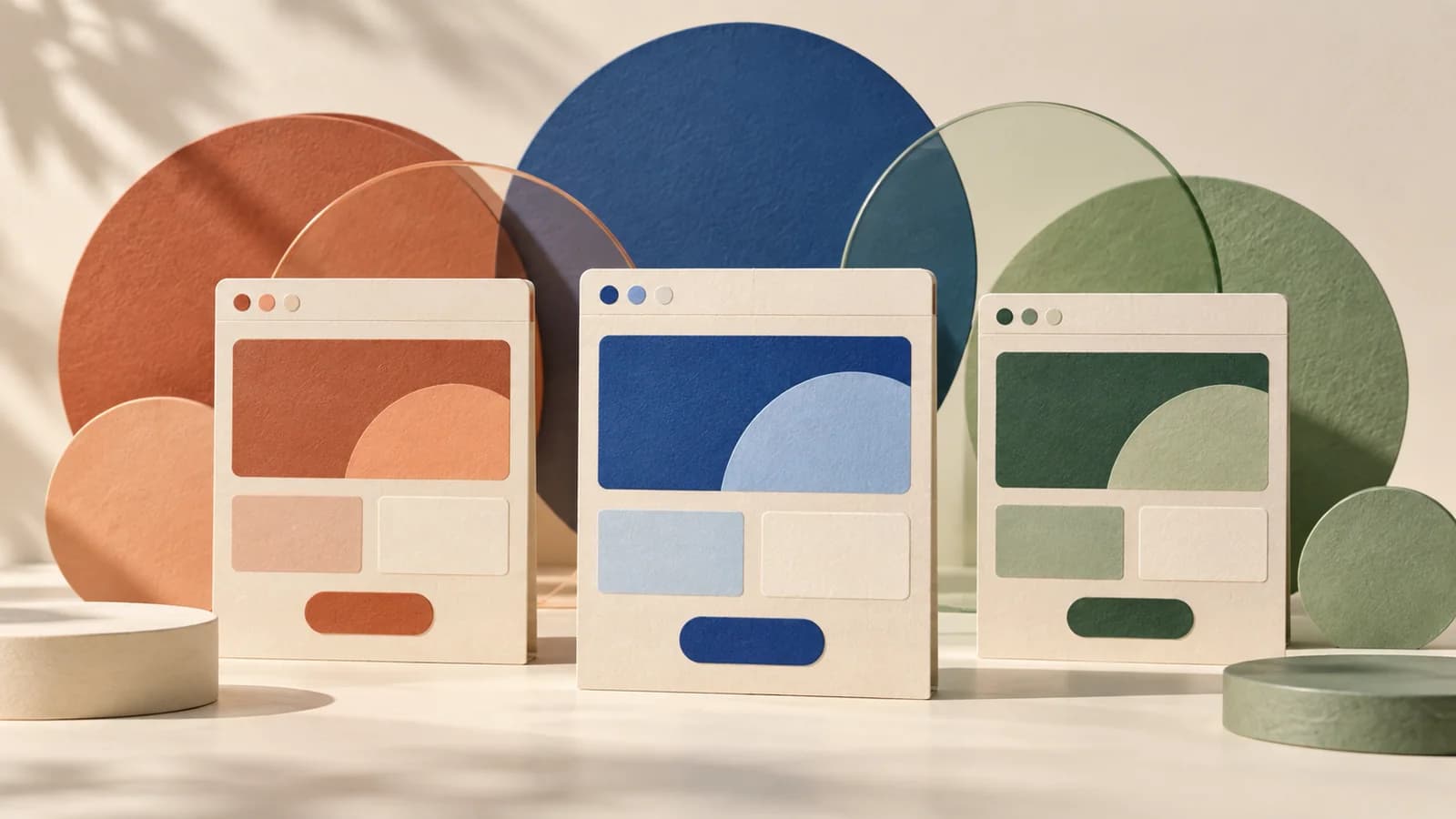
Imagine an independent architecture studio showing the same projects, prices and team in three visual directions. These are design hypotheses to explore, not measured psychological effects.
Warm ivory, terracotta and charcoal. This direction could support a story about materials, craft and the people behind a project. Use the terracotta selectively around an invitation to discuss a brief. Ask whether the result feels considered or whether the warm tones make the projects themselves harder to distinguish.
Pale gray, cobalt and deep navy. This direction could support a more technical presentation: clear project stages, precise drawings and well-organised information. Ask whether prospective clients can still see the studio's personality. A familiar corporate palette may be appropriate, but it does not establish competence by itself.
Cream, forest green and muted sage. This direction could support a portfolio focused on gardens, natural materials or landscape integration. Ask what claims the palette appears to imply. Green decoration cannot substantiate an environmental benefit that the project description does not explain.
Keep the content and layout fixed while comparing these directions. Otherwise you may prefer the version with better photography or clearer writing and mistakenly credit its palette. Ask reviewers to describe the business in their own words before showing them your intended brand adjectives.
A color has several jobs on a website
Separate brand expression from navigation and feedback. A website may need an expressive accent for recognition, a clear treatment for the main action, and distinct ways to communicate success, errors and warnings. Those roles do not have to use the same color.
Suppose your logo is red. That does not mean every red shape on the page should look like a destructive action. You can keep the logo, give ordinary actions a consistent treatment and make deletion unmistakable through its label, placement and confirmation. The complete pattern carries the meaning.
Write down the roles before debating individual shades: background, surface, main text, secondary text, primary action, link, focus and feedback. This makes review concrete. Instead of asking whether a blue is attractive, ask whether the primary action is recognisable and whether links remain identifiable inside paragraphs. A consistent design system preserves those decisions across pages.
Why the “best button color” question is incomplete
Imagine an orange button on a page full of orange cards, orange icons and orange headings. Now place the same button on a quieter neutral page. Its relationship to the surrounding elements has changed, even though its color value has not.
Our design recommendation is to evaluate the action within that hierarchy. Give the primary next step enough separation from nearby decoration. Make secondary options visually quieter when they are genuinely secondary. Keep the wording specific: “Request a site estimate” explains more than “Go,” whatever color you choose.
If you compare two buttons, state what changed. Did you alter only hue, or also brightness, text contrast, size and placement? If the second option is easier to read, a better result would not isolate the emotional effect of its hue. It would be evidence about the complete treatment you tested.
Review the homepage message before making color responsible for weak enquiries. A visitor who cannot tell what you offer needs a clearer explanation as well as a visible next step.
The most persuasive palette is still one people can read
WCAG 2.2's Level AA text-contrast criterion generally requires at least 4.5:1 for ordinary text and 3:1 for large text, with defined exceptions. Large text means at least 18 point, or 14 point when bold. These are measured foreground/background relationships, not judgments about which hue looks stronger. See W3C's contrast guidance.
Check actual pairs: button label against button fill, supporting copy against a tinted panel, and link text against its background. Include hover and focus states. A brand palette on a presentation slide does not tell you whether the final interface is readable.
WCAG also requires that color not be the only visual means of conveying information. A failed field needs an understandable message, not just a red outline; a selected option can include a checkmark or explicit label. See W3C's guidance on the use of color.
Our practical rule is to review meaning separately from decoration. Temporarily remove color in a design review and ask which distinctions become unclear. That exercise can reveal reliance on hue, but it is not a substitute for contrast measurement or accessibility testing. The website accessibility guide covers the wider experience.
Dark mode needs its own review
A palette approved on white should not be accepted on a dark background without checking it again. Create a real dark version of the service page, form and navigation. Review the same text/background pairs and interaction states you checked in light mode.
Pay attention to the role of large color areas. An accent that works as a small button may dominate when used across an entire panel. Ask whether the page still has a clear reading order, and whether photographs and illustrations belong naturally within it.
Review both language versions too. A longer Romanian label can wrap differently from its English equivalent, changing the apparent weight of a button or badge. The color may be identical while the composition is no longer equivalent.
Run a small review that produces useful evidence
Start with a task rather than a preference poll. Show someone a service page and ask how they would request a quote, where they would find the price, or what happens after submission. Observe the route they take before asking whether they like the colors.
Then ask about interpretation. Which element seemed interactive? What did the highlighted card communicate? Did the palette suggest anything about the offer that the page did not support? A few such sessions can uncover misunderstandings, though they cannot estimate a population-wide conversion lift.
If you have enough traffic for a controlled experiment, define the outcome, comparison and decision rule before starting. Keep the offer and other page elements stable. Examine completed, relevant enquiries as well as clicks, and avoid declaring a winner from a few extra visits. On a low-traffic business site, resolving a visible usability problem is often a more practical next step than chasing a statistically weak color test.
Choose a palette you can explain without a mood chart
Before approving the design, finish four sentences: “This is what the visitor should notice first.” “This treatment means an action is available.” “This is how we communicate a problem.” “These are the color pairs we checked for readability.”
You can still be expressive. An unusual accent, a warm background or a restrained dark surface can help give a site character. The useful discipline is to connect that choice to the actual offer and verify that it works across the page.
If you are preparing a website project brief, bring examples of the experience you want and the audience you serve. “We want visitors to feel welcome and understand the next step” gives a designer something to investigate. “Make the button blue because blue creates trust” closes the conversation before the interesting work begins.