Mobile app and website UI/UX design: what changes and why
An in-depth guide to UI and UX choices for mobile apps and websites: navigation, layouts, forms, accessibility, offline use and choosing the right platform.
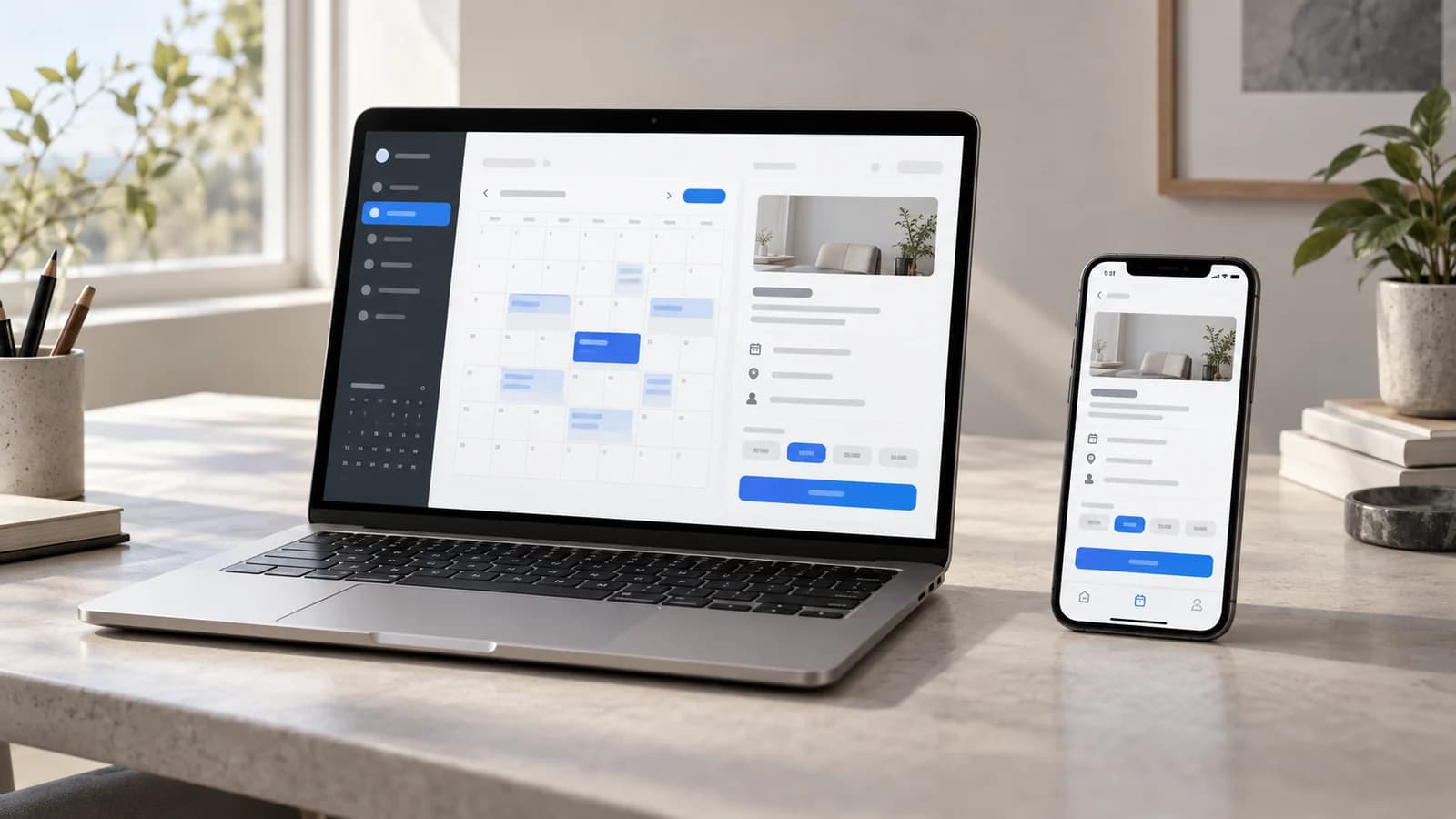
A customer finds your business through a link a friend sends them. They compare a few services on a laptop, book on their phone and, a week later, open your app to change the appointment. They expect the business to remember what they chose, even though they have moved between three different places to get things done.
That expectation is where many design decisions become difficult. Should the app open with the same introduction as the website? Does a calendar that works well on a laptop still make sense on a phone? What should happen if a call interrupts the booking just after the customer taps Confirm?
The answers affect far more than the appearance of a screen. They determine how much people have to remember, how confidently they can make a decision and how easily they can recover when something goes wrong. We'll use an imaginary appointment business to work through those choices, from a customer's first visit to the tools its staff use every day.
The cover is an AI-generated editorial illustration, not a screenshot of a delivered product.
1. Separate the platform from the size of the screen
UI, or user interface, covers what people use to interact with a product: navigation, typography, controls, spacing and feedback. UX, or user experience, covers the whole process of using the service. It starts when someone tries to understand the offer and continues through booking, confirmation, changes and support. The size and colour of a booking button are UI decisions. Whether its label makes the payment or commitment clear is also a UX decision.
Before comparing the designs, it helps to untangle the terms. A website can run on a phone. A native app can run on a tablet with a keyboard. A desktop browser can occupy a window barely wider than a phone screen. Calling one design “mobile” and another “web” leaves much of the actual situation unexplained.
A native mobile app is built for a particular platform, such as iOS or Android, and follows its conventions. A responsive website rearranges its content to suit the available space. A web application lets people do ongoing work in a browser, such as managing a calendar or customer records. A progressive web app, or PWA, can add installation and offline features where those have been built and are supported. A single booking service may fit several of these descriptions.
Installing a web app doesn't guarantee offline access either. MDN's PWA installability guide distinguishes installation from the work needed to provide offline features. We'll return to that difference below.
For a business owner, a better starting point is to describe the work: “Customers compare our services, book an appointment and occasionally change it. Staff manage the schedule all day.” That gives a designer much more to work with than “We need an app version of the website.”
2. Design the first visit and the twentieth visit differently
Someone arriving from search may have never heard of your business. They might land directly on a pricing page, without seeing the introduction you carefully placed on the homepage. The page they actually reach needs to explain the service, who provides it, how pricing works and what they can do next.
A regular customer opening the app has a different need. They may be standing outside a building looking for the address, or checking whether tomorrow's appointment is at ten or eleven. A large promotional introduction gets in the way. The next booking, its location and a clear way to reschedule would be more useful on that first screen.
Of course, installing an app doesn't make someone an experienced customer, and using a browser doesn't make them a stranger. The design should respond to what is known about the visit. A new app user needs a useful introduction; someone returning to the website should be able to find their existing booking without reading the sales pitch again.
Installation asks for effort before the customer has necessarily received anything. For a one-off consultation, a link that opens immediately may be all they want. If they return every week, an app that remembers useful choices and makes repeat bookings easier has a stronger case. Its continuing usefulness needs to justify the installation, permissions and updates.
Account creation deserves the same scrutiny. Does the business need it to handle this booking safely, or is registration being added out of habit? If identity is essential, explain why and what the customer can do with the account later.
Before settling on a home screen, sketch how people arrive: through a shared service link, a reminder, an existing account or an expired session. Follow each route to see whether the person can continue what they came to do.
3. Navigation must explain location, movement and return
On a public website, navigation helps people investigate the business. They may want to compare services, look at examples, check prices and find contact details in an order of their own choosing. In a customer app, a smaller set of frequently used sections, such as Bookings, Explore and Account, may be enough.
“Bookings” and “Book an appointment” sound similar, but do different jobs. The first takes someone to a section; the second starts a process. Apple's tab bar guidance uses tabs for top-level sections, with labels and navigation state preserved within each one. Mixing a command such as Cancel booking into that bar would make a tap much less predictable.
A bottom bar can work well on a mobile website too, especially when people repeatedly move between a few sections. But it occupies space throughout the visit. Add browser controls, a cookie notice and the keyboard, and the content can end up squeezed between several fixed layers. A small brochure website may be better served by ordinary links and a clear menu.
Consider a customer who filters appointments by location, opens one and then goes back. Losing the filter forces them to repeat work they have just done. The situation becomes more complicated when a reminder takes them straight into an appointment. Android's navigation principles distinguish Back, which retraces navigation, from Up, which moves to a parent screen, and explain how direct links affect the back stack.
In a browser, people also expect to refresh, use Back and Forward, open a link in another tab and share a useful page. Application-style transitions need to honour those expectations; MDN's History API guide explains the mechanics. A shareable service or filter selection should have a suitable URL, while sensitive information stays out of the address.
Try the sequence in a prototype: open a direct link, change a filter, inspect a record, go back and switch sections. Reviewing the screens separately won't reveal where the connections fail.
4. Touch, pointer and keyboard require different allowances
Try selecting a small calendar slot with a thumb: the finger covers the thing you are trying to hit. A pointer offers more precision, while a keyboard moves through controls one at a time. These differences explain why a layout that feels comfortable with a mouse can be frustrating on a phone, even when everything technically fits.
Keep platform measurements distinct. Apple's accessibility guidance lists a 44 × 44 point default control size for iOS and iPadOS. Android's accessibility guidance recommends touch targets of at least 48 dp. WCAG 2.2's Level AA target-size criterion specifies 24 × 24 CSS pixels, with defined spacing, equivalent-control, inline, user-agent and essential exceptions. Points, dp and CSS pixels are different logical units, and these documents serve different purposes.
Meeting a minimum still leaves a design decision to make. A button used to confirm a booking should be easy to find and press confidently, including when someone is holding the phone in one hand. An icon can stay visually small while padding makes its active area larger, as long as neighbouring controls remain clearly separated.
Screen width won't tell you which input someone uses. Tablets can have trackpads, laptops can have touchscreens and phones can use external keyboards. A time slot or cancellation control must therefore be available without hovering over it. web.dev's interaction guidance covers this separation between layout and input.
Gestures can make frequent actions convenient once people know them. A swipe to remove a saved item is useful as a shortcut alongside a visible menu. Dragging an appointment can sit alongside a Change time command. Vibration can reinforce the result in a native app, but someone who cannot feel or interpret it still needs clear visual and accessible feedback.
The edges of the screen need attention too. System gestures, cutouts, browser bars and keyboards all take space. Check a fixed Confirm booking button with the keyboard open and the last field in focus. Its convenient position becomes a problem if it hides the price or the field someone is trying to correct.
5. Adapt information density to the work
A larger display earns its space when it helps people compare. A customer can see dates, providers and prices together; a receptionist can keep the calendar beside the details of the selected booking. Simply stretching a phone layout across a laptop misses the chance to make those relationships easier to see.
On a phone, those choices may work better as a sequence: service, time, then review. The customer should still know what they have already selected and be able to change it. Showing details when they become relevant, often called progressive disclosure, can keep each step manageable. Price, eligibility and booking conditions still need to be clear before the person commits.
Some adaptations go beyond rearranging the same boxes. Android's adaptive app guidance considers window size, device posture and font scaling. A bottom navigation bar can become a rail; a list and its details can move from separate screens to two panes. A web application can benefit from similar changes when its window grows or shrinks.
Text needs room to behave naturally as well. Wide paragraphs become tiring to follow, while small text is hard to read even if it makes a screen look tidier. A fixed-height card that fits a short English label may cut off its Romanian translation or an enlarged version of the same label. Review the layout with the words and text settings people will actually use.
A table is a good example of why a familiar responsive pattern needs judgment. Converting every row into a card may make an upcoming-appointments list easier to scan. Do the same to a staff schedule and comparing times across providers may become much harder. In that case, keeping the table and letting it scroll within its own area can preserve something valuable.
For the appointment business, the choices might look like this:
| Decision | Public website | Returning customer app |
|---|---|---|
| Starting point | Explain services, prices and booking conditions. | Show the next appointment and ways to manage it. |
| Navigation | Link directly to services, prices and contact details. | Keep Bookings, Explore and Account easy to find. |
| Booking layout | Show options side by side when there is room. | Let people review earlier choices at each step. |
| Permissions | Let people explore before asking for device access. | Ask when a customer chooses the feature that needs access. |
| Return visit | Keep the selected service and filters when people go back. | Return to the unfinished booking after an interruption. |
6. Forms and onboarding should reduce uncertainty
On a phone, each extra field means more typing, more autocorrection and less room to see the rest of the form. A desktop gives people a better overview, but it doesn't make unnecessary questions less irritating. Before choosing the field layout, ask whether the business needs each answer at this point in the process. A billing address may belong later than the first availability check.
The right control can save a surprising amount of effort. A date picker may suit next week's appointment and be painfully slow for entering a birth year several decades ago. Email and telephone fields should use the relevant keyboard and input settings. Autofill and password managers should be allowed to do their jobs.
Labels need to remain visible after typing begins. A placeholder such as “Email address” vanishes as soon as someone enters a character; a proper label continues to explain the field and is programmatically associated with it, as W3C's form-label guidance describes. Formatting instructions belong near the field before an error happens. If several fields need correction, a summary can help the person find them all.
Splitting a long form into steps can help when each step represents a sensible decision. It can also turn a short form into a frustrating series of screens. Customers need to understand how much remains, move back without losing answers and review the booking before submitting it. The useful question is whether the process is easier to finish and correct, rather than whether it shows fewer fields at once.
A short explanation beside an unfamiliar feature can be welcome. A compulsory tour of obvious buttons becomes another thing to dismiss. Introduce advanced options when they become relevant, and let experienced customers get on with their booking.
The expired session is worth designing early too. Someone who has chosen a service and time shouldn't have to reconstruct the booking after signing in again. Decide which draft details can safely be retained, where and for how long, particularly if the form contains sensitive information or the device is shared.
7. Performance includes feedback and recovery
Waiting for a page, waiting for a button to respond and watching that button move just before a tap are three different frustrations. Reducing the download size may improve the first without fixing the other two. A performance review needs to follow what the customer sees and does through the booking, rather than stop at the initial loading screen.
For websites, Core Web Vitals measure loading, interaction responsiveness and visual stability. Current good thresholds are LCP at or below 2.5 seconds, INP at or below 200 milliseconds and CLS at or below 0.1, assessed at the 75th percentile with mobile and desktop considered separately. These are useful technical measures to investigate alongside whether people can understand and finish the booking.
Native apps need their own measures: launch time, responsiveness, crashes and whether work is restored after the operating system closes the app. An installed app can still spend several seconds waiting for a server. A simple website can make a frequent action very quick. The experience on the customer's device and connection matters more than the label attached to the technology.
After a tap on Confirm, silence creates uncertainty. Did the request go through? Should the customer tap again? A pending message tells them that a request is underway; confirmation should follow only after the service accepts it. Behind the interface, repeat submissions need to be handled without creating duplicate bookings. If the request fails, keeping the completed form and offering a useful next step saves the customer from starting over.
Some actions can appear to complete before the server responds. This is often called an optimistic update, and it can work well for a reversible choice such as saving a display preference. An appointment is different: someone else may take the time slot, or a payment may fail. Until the service accepts the booking, the screen needs to show that it is still being processed.
Review these less comfortable moments alongside the finished booking screen. What appears when there are no available times? When only part of the page loads? When a request times out? Each screen needs to help someone make a sensible next move.
8. Be clear about what works offline
Imagine opening the app outside a building with poor reception. Being able to read the address of an appointment already booked would be useful. Booking a new appointment while disconnected is a different promise, because availability can change elsewhere. Both native and web products need to decide exactly which of these things they can support.
For a website, MDN's offline and background-operation guide explains how service workers can provide offline access. Android's offline-first guidance covers local and network data, synchronisation and conflicts. Choosing those techniques still leaves the team to decide which information to save, how old it may be and which changes require a live connection.
The wording on the screen should make the difference clear. “Saved on this device,” “Waiting to send” and “Confirmed” mean different things. A queued request may be sent when the connection returns, but the customer needs to know that their appointment is not yet secured. They also need to know whether they can close the app and how to cancel or retry the request.
Conflicts need a usable resolution too. If the chosen slot has been taken by the time a queued request arrives, offer alternatives and keep the customer's service and location preferences. A generic error that discards everything turns a connection problem into extra work.
Even a connected customer gets interrupted. They check a message, complete a payment authentication step in another app or leave a browser tab open overnight. On their return, restore the useful parts of the booking and recheck anything that may have changed. Prices and availability from yesterday shouldn't quietly pass as current information.
Decide what happens to downloaded data after sign-out or a change of account, particularly on shared devices. A useful offline brief says which records remain available, which actions can wait and how conflicts are handled.
9. Ask for permissions at the moment of value
Opening an unfamiliar app and immediately being asked for location, camera and notification access is a lot to take in. A request makes more sense after the customer chooses a feature that would benefit from it.
Apple's privacy guidance and Android's permission principles recommend asking in context and keeping the product usable when access is declined. In the booking service, the location request could follow a tap on Find a nearby provider. Someone who declines should still be able to type a town or choose a location from a list.
A reminder request belongs at a similarly useful moment, such as after a booking is confirmed. Explain what the reminders contain and let the customer control them. Opening one should lead to the relevant appointment, with a sensible route through sign-in if necessary. If the appointment has changed, that needs to be clear on arrival.
Notifications aren't limited to native apps. WebKit documents push for Home Screen web apps on iOS and iPadOS, introduced in version 16.4, with a permission request following direct user interaction. The Home Screen condition matters: an ordinary browser tab should not be assumed to offer the same experience. Check the browser, operating system and installation mode your customers will use before choosing the approach.
People change settings and miss reminders, so keep appointment details available inside the product. Choose any additional communication channels around the service's needs and the customer's preferences.
10. Accessibility changes the design from the beginning
Accessibility affects decisions that are easy to overlook in a visual review: the order information is read, the name announced for a button and where keyboard focus moves after a dialog closes. Native controls and semantic HTML provide a useful foundation. A custom control needs to communicate its role, value and state just as clearly to assistive technology.
In the appointment picker, for example, a screen reader user needs to distinguish Tuesday at ten from Wednesday at ten and understand which option is selected. If submission fails, the error should be announced and easy to reach. A red border or vibration alone leaves some customers without the information they need to continue.
Enlarging text often reveals problems that ordinary screenshots hide. WCAG's reflow guidance addresses ordinary content at the equivalent of 320 CSS pixels wide, with defined exceptions for content requiring two-dimensional layout. Native apps need testing with their supported text-size settings too. A label must be able to grow without being cropped, pushing a price out of view or hiding the final form action.
Fixed controls can cause trouble here. A sticky booking button may cover the field that a keyboard user is trying to correct. WCAG's Focus Not Obscured criterion requires that focused controls are not entirely hidden by author-created content at Level AA. Keeping the whole focused control visible is a more comfortable design goal.
The alternatives to gestures mentioned earlier have an accessibility purpose as well. WCAG's dragging criterion calls for a single-pointer alternative unless an exception applies. A Move to menu lets someone reposition an appointment through taps or clicks without having to drag it accurately. Keyboard support alone doesn't provide that alternative.
Include both light and dark appearances, contrast, reduced motion and real assistive technologies in the review. When animations are removed, the booking should remain understandable and usable. Automated checks help find some problems; completing the booking with a keyboard or screen reader answers questions that those checks leave open.
11. Keep the brand consistent and the controls familiar
A customer should recognise the business when moving from its website to its app. Type, colours, tone of voice and the way information is prioritised can provide that continuity. Every button and picker doesn't have to look identical for the products to feel related.
A sheet in an iOS app and a dialog on the website might let someone change the same appointment in slightly different ways. Familiar selection and dismissal behaviour helps the person use what they already know. Building a bespoke imitation of every system control means taking on its keyboard behaviour, accessibility and future maintenance as well as its appearance. There should be a worthwhile reason to do that.
The most useful shared rules describe what a design means. A cancellation should explain its consequences wherever it appears. The primary action should be recognisable, and an error should help someone recover. Those principles leave room for a platform's own controls. A rule requiring one exact custom dropdown everywhere leaves much less room to choose the better interaction.
A design system also needs examples of what happens between the polished screens: loading, errors, disabled actions, keyboard focus and long translations. Dark mode needs its own contrast review rather than a simple colour inversion. These details are what keep the system useful when several people are building different parts of the product.
The words and facts need to agree too. If the website says an appointment is confirmed while the app says it is awaiting approval, matching colours won't resolve the confusion. Prices, status labels and cancellation explanations should come from the same rules. Our guide to a consistent design system looks at how teams keep these decisions usable as a product grows.
12. Work through one service across three surfaces
Putting these choices together makes the differences easier to see. Our imaginary business has several locations, customers who are booking for the first time and regulars who return. Its staff need to keep the day's schedule running. Here is how the three experiences could work.
The public website gives a first-time visitor enough information to decide whether to book: what the service includes, how long it takes, its price, location and relevant conditions. They can begin without installing anything. A wide browser window shows dates beside appointment details; on a phone, the same choices become a sequence. In either case, returning from a detail page keeps the filters they selected.
The customer app, if enough people return to justify one, opens with the next appointment. Bookings, Explore and Account remain easy to find. Rescheduling starts inside the relevant booking, with the existing service and location already selected. The app offers reminders after confirmation. A reminder opens that appointment, including after sign-in if required. Without a connection, downloaded details remain readable, with their age clear, while changes wait for the service to accept them.
The staff web application puts the schedule and selected booking side by side so that a receptionist can compare options without repeatedly opening and closing records. It supports keyboard use, and moving an appointment has a menu alternative to dragging. Before a change that affects a customer, the confirmation explains what will happen. In a narrow tablet window, details can move to a separate view while the day and filters stay selected.
These differences follow the work each person is doing. The first-time visitor needs an explanation, the regular customer needs their booking and the receptionist needs an overview. Research might also show that customers book too infrequently to want an app at all. In that case, a good responsive website could serve them, while staff still benefit from a dedicated browser workspace.
The prototype should cover the moments between these screens too: following a reminder, changing an appointment, losing the connection, declining permission and signing in again. These situations reveal whether the choices work together.
13. Choose a platform through evidence, then verify the journey
The platform choice becomes easier to discuss once the everyday use is clear. A public link is useful for discovery, sharing and occasional visits. A native app has a stronger case when frequent use and particular device features justify installation and ongoing support. A PWA may cover the required features through the browser, provided they work in the environments your customers use. Our article on when a business needs an iOS app explores the investment decision; the mobile-first website guide covers the browser foundation.
Before approving the platform and design, make sure the team can answer five questions:
- What does the person need to finish? Include the information they need before making a commitment.
- Where and how will they use it? Consider window sizes, input methods, connections, languages and accessibility settings.
- What happens if they stop halfway through? Decide what is saved, what works offline and when an action becomes final.
- Which device features are essential? Check their support and provide a clear way forward when access is declined.
- Who will look after the product? Allow for browser changes, operating-system updates, content, accessibility and release testing.
Then put complete tasks in front of people who would actually use the service. Ask a new customer to compare two options, a regular to change a booking and a staff member to resolve a conflict. Watch where they hesitate, what they misunderstand and whether they can recover without help. A few sessions can reveal specific problems, although they cannot establish how much a change will improve conversion across the whole audience.
The measurements should follow the work too: completed bookings, errors people can recover from, time spent on routine staff work, support requests and successful returns after an interruption. Compare similar groups. Someone who has already installed the app has made a different commitment from a new visitor arriving through search, so a higher completion rate in the app would not by itself prove that its design is better.
Testing on real devices and browsers should include narrow windows, enlarged text, all supported languages, keyboard and screen-reader use, weak connections, expired sessions and declined permissions. Write the expected behaviour for empty and failed screens into the acceptance criteria. Otherwise those screens are likely to get less attention than the successful booking shown in the presentation.
A useful brief can explain what a first-time customer sees, what a returning customer can skip and what happens when a booking is interrupted. With those details agreed, the team has a reason for each major design choice and a way to check it. If you are working through a similar decision, tell us about the service and the people who need to use it.